Introduction
Optimizing your Chrome viewport on a MacBook can significantly enhance your browsing experience. Whether you’re a developer needing precise screen dimensions or a user wanting better readability, adjusting your viewport settings can make a big difference. This guide will help you understand Chrome viewports and show you how to optimize them for your MacBook.
Understanding Chrome Viewports
A viewport in Chrome refers to the visible area of a web page on your device’s screen. It determines how much of a webpage you can see without scrolling. Viewports are essential for both developers and everyday users because they dictate how content is displayed.
For developers, adjusting viewports helps in designing responsive websites that look good on different devices and screen sizes. For regular users, it enhances browsing by ensuring that text is readable, and images are clear. Understanding and tweaking these settings enable a more tailored browsing experience.

Why Optimize Your Chrome Viewport on MacBook?
Optimizing your Chrome viewport on a MacBook ensures that webpages render correctly and are easy to navigate. This is particularly beneficial for developers working on responsive design, as well as users who want a consistent and enjoyable browsing experience.
A well-optimized viewport can help reduce eye strain by adjusting the text size and layout to fit your screen correctly. It also improves loading times by only loading the necessary content within the viewport, which can enhance your MacBook’s performance. Therefore, optimizing your Chrome viewport directly impacts the usability and efficiency of your browsing.
How to Adjust Viewport Settings in Chrome
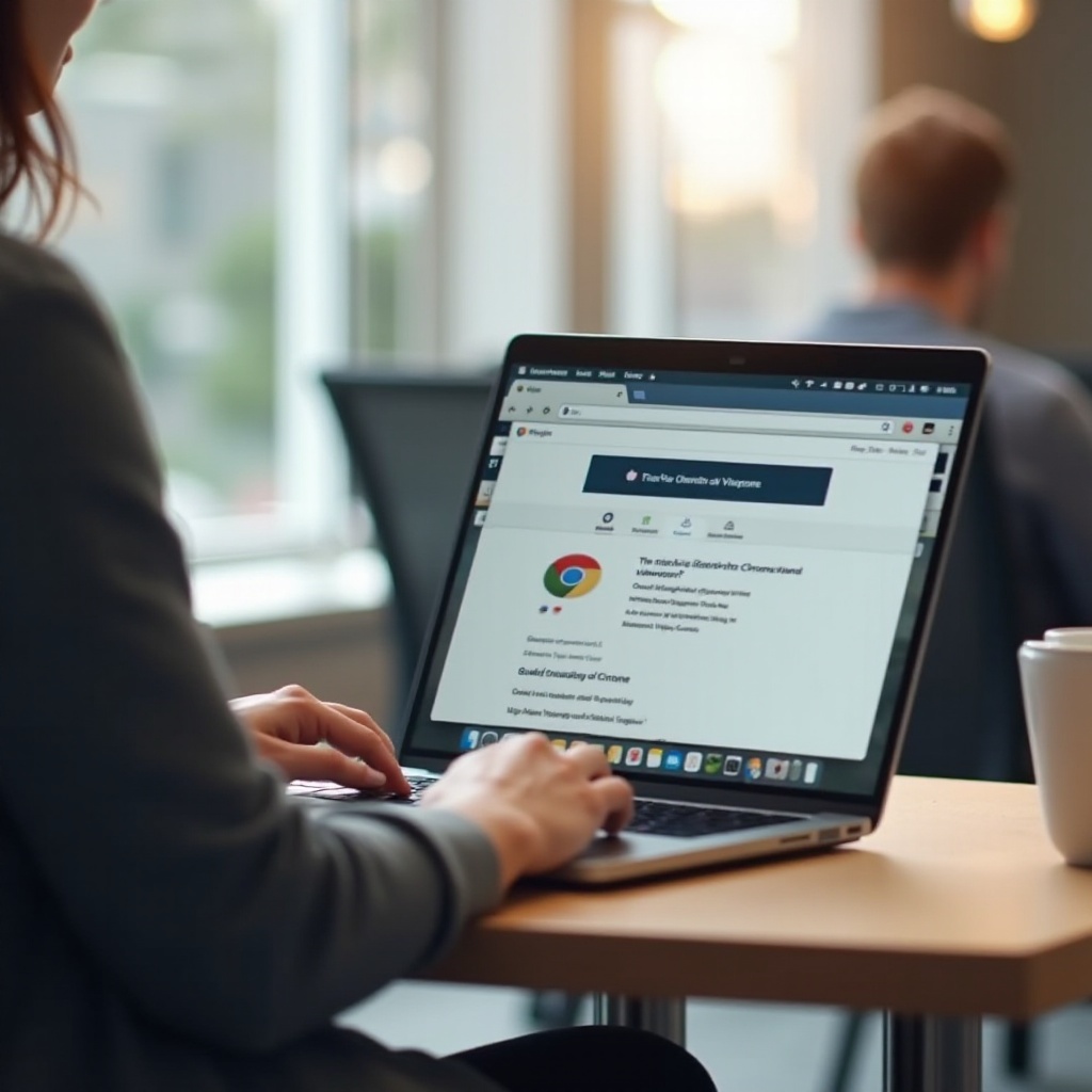
Accessing Chrome DevTools
To start optimizing your viewport settings, you need to access Chrome DevTools. Here’s how you can do it:
- Open Chrome: Launch the Chrome browser on your MacBook.
- Open DevTools: Click on the three vertical dots in the top-right corner, go to ‘More tools’ > ‘Developer tools,’ or press
Cmd + Option + I.
Step-by-step Adjustment Guide
Once you have DevTools open, follow these steps:
- Navigate to the Device Toolbar: In DevTools, click the device icon or press
Cmd + Shift + Mto toggle the device toolbar. - Select Device: Choose a predefined device from the dropdown or create a custom one by setting the viewport dimensions manually.
- Scale and Adjust: Adjust the zoom level if necessary to see how your content resizes accordingly.
Examples of Viewport Configurations
Here are some examples of viewport settings for different uses:
- Mobile View: Set the viewport to 375×667 pixels to simulate iPhone 6/7/8 dimensions.
- Tablet View: A viewport of 768×1024 pixels mimics the iPad.
- Desktop View: Use the default or custom dimensions, such as 1280×800 pixels, for MacBook screens.
Best Practices for Viewport Configuration
Recommended Settings for Different Tasks
For various tasks, here are some settings to consider:
- Web Design and Development: Utilize dynamic viewports to test responsiveness across multiple devices.
- Content Reading: Adjust zoom levels and screen resolutions to ensure readability without constant scrolling.
- Gaming and Interactive Media: Opt for higher resolutions and finer control over dimensions to enhance graphical details.
Integrating these best practices ensures that your viewport configurations are optimized for each specific task, providing a seamless and efficient user experience.
Using Extensions for Enhanced Functionality
Several Chrome extensions can assist in achieving optimal viewport settings:
- Window Resizer: Quickly resize your browser window to various resolutions.
- Viewport Resizer – Responsive Testing Tool: Easily test your site on different screen sizes with one click.
- Responsive Viewer: View your site across multiple devices at once to ensure consistency.
Integrating these tools into your workflow can streamline the process, saving valuable time and enhancing precision.

Troubleshooting Common Viewport Issues
Encountering issues with viewport settings? Here are some common problems and solutions:
- Content Overflow: Ensure you have set the viewport to scale properly with content less than the visible area.
- Blurry Images or Texts: Adjust your device’s pixel ratio and ensure that the viewport’s scale factor is accurate.
- Unresponsive Layouts: Double-check your responsive design settings and CSS media queries to guarantee proper viewport adaptation.
Addressing these issues promptly can maintain a smooth and efficient browsing experience on your MacBook.
Conclusion
Enhancing your MacBook experience with Chrome viewport optimization can significantly improve your web interactions. Whether for web development or regular browsing, customizing these settings ensures that content is displayed correctly, improving both usability and accessibility. By understanding, adjusting, and troubleshooting viewports, you can maximize your MacBook’s performance and your productivity.
Frequently Asked Questions
How do I reset the viewport settings in Chrome?
To reset your viewport settings, simply close the DevTools console and reopen it. This action reverts any changes made during your session back to default settings.
What are the best Chrome extensions for viewport management?
The best extensions include Window Resizer, Viewport Resizer – Responsive Testing Tool, and Responsive Viewer. These tools provide easy ways to test and adjust your viewport settings efficiently.
Can I synchronize my viewport settings across multiple devices?
Viewport settings are specific to each browser session. However, using Chrome’s synchronization features for extensions and browser configurations, you can achieve a level of consistency in your setup across multiple devices.